Favorite Font/Typography
Hye, Welcome back.
As this week, I have third assessments regarding wording fonts which are require the SAN SERIF and SERIF fonts. San serif is a font which do not have the tail at the end of each of the alphabet, while the serif have a tail in every of the alphabet. Here are some of the fonts.San serif 1 (Arial)
First of all, this type of font is a common font use in many articles or assignments. As for me, this kind of font is easy to read and easy to recognize the mistakes.
Next, Calibri is also a part of san serif family. It has a curve in every of the alphabet. Calibri often use in some formal text.
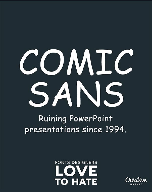
San serif 3 (Comic Sans)
This is one of my favourite font. I like comic sans that much because this font make me easy to read and understand. This type of font usually used in comics as it is easy to make kids or the reader to understand the story all about.
Serif 1 (Times New Roman)
Here is one of the Serif's family that is times new roman. This font usually use in any of text or article or typography as it is a formal font. Almost of the wordings in this world are using it. It is quite
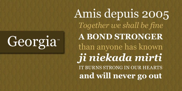
Serif 2 (Georgia)
This is also one of my favorite font. This kind of font have its own uniqueness where the edge of the alphabets are not to sharp but a little bit cursive. This font I often use to type in a normal or informal text.
Serif 3 (Century)
Lastly, a part of Serif's family is century. This font are likely to the times new roman. But however, this font is a little bit thin compare to the TNR.
What I can conclude are all the San serif fonts are cursive and not have those sharp edges at the end of the alphabets compare to the Serif fonts. San serif font often use in comics and etc. while the serif font often use in logos and etc.
That's all from me. Thanks for reading.


Comments
Post a Comment